
Raster vs vector: which one does your logo actually need?
Why your logo looks crisp on a business card but fuzzy on a billboard — and how to spot a raster file before it costs you a reprint.
Sooner or later, every brand hits the same wall: someone needs the logo "bigger" — for a pull-up banner, a shop sign, a side of a van — and the only file lying around is a JPEG dragged off the website. Blow it up and it turns into a mosaic.
That's the difference between raster and vector in one sentence. Here's the slightly longer version, without the jargon.
Raster: a picture made of dots
A raster image is a grid of tiny coloured squares — pixels. Every photo on your phone, every JPEG, PNG and GIF on the web, is raster.
Zoom in close enough and the dots reveal themselves. Stretch the image bigger than it was made and the dots stretch with it — that's the blurry, blocky look everyone recognises.
Raster is brilliant for photography and anything with subtle tonal detail. It's a poor choice for logos that need to live at every size.
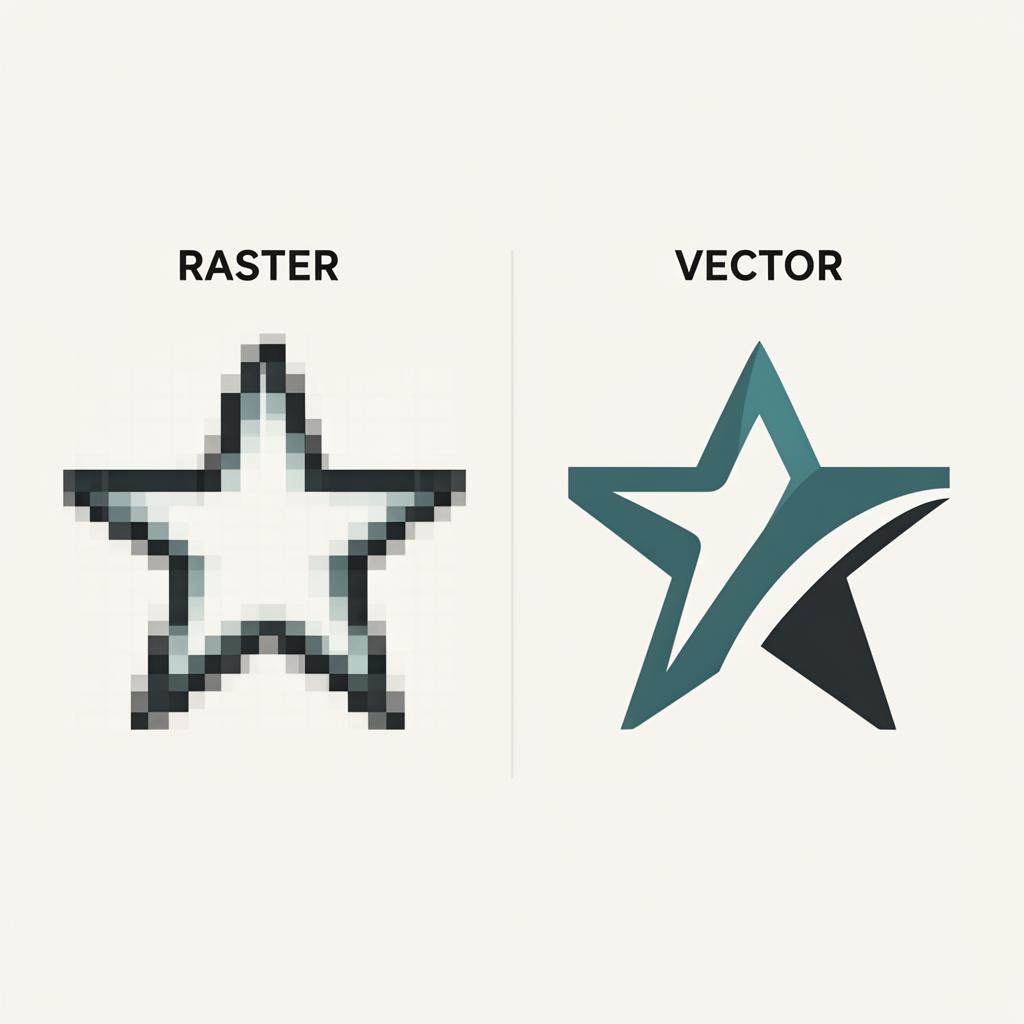
Vector: a picture made of maths
A vector image isn't made of pixels at all. It's a set of instructions — points, lines and curves — that tell the software how to draw the shape. Scale it up to fit a billboard or down to fit a favicon and it stays razor sharp, because it's redrawn at every size from scratch.
That's why logos, icons and illustrations should live as vectors. One master file, infinite sizes, no quality loss.
How to tell what you've got
Quick file-extension cheat sheet:
- Raster:
.jpg,.jpeg,.png,.gif,.tif,.bmp,.psd - Vector:
.svg,.ai,.eps,.pdf(if built from vectors)
A .pdf is the slippery one — it can contain either, or both. If it was exported from Illustrator with the artwork still as paths, it scales beautifully. If someone placed a JPEG into a PDF and saved it, you've just got a raster in a smarter wrapper.
Why this matters for print
Print pushes files harder than screens ever will. A logo that looks fine at 100px on a website can fall apart at 1 metre wide on a banner. Vector files survive that journey. Raster files don't.
When we receive brand assets for a packaging or campaign job, the first thing we check is whether the logo is genuinely vector. If it isn't, we'll quietly redraw it — tracing the original by eye in Illustrator — so the rest of the artwork can be built without compromise.
"Can't I just upscale my logo in Photoshop?"
Sort of. AI upscaling tools have got impressively good for photos, but for a logo they're guessing — and the small inaccuracies show up the moment the file lands on a press. A proper vector redraw takes an experienced artworker an hour or two and lasts forever.
In short
- Photos → raster, always.
- Logos, icons, illustrations → vector, always.
- If you only have a raster version of your logo, get it redrawn as a vector once. You'll use it for the next ten years.
Stuck with a low-res logo and a print deadline? Get in touch — we'll redraw it cleanly as a proper vector master, ready for anything from a beer label to a billboard.