
RGB vs CMYK: a friendly guide to colour spaces for print
Why your screen colours never quite match the printed result — and how to design in the right colour space from the start.
If you've ever sent a file off to a printer, you've probably bumped into the letters RGB and CMYK. They aren't obscure dance routines — they're colour spaces, and they're the single biggest reason printed work sometimes looks different to what you saw on your screen.
Here's the short, painless version.
What's a colour space, anyway?
Think of a colour space as a palette: a fixed set of colours you're allowed to mix from. Design inside one palette and you can't reach a colour that lives in another.
The two you'll meet daily:
- RGB — Red, Green, Blue. The colour space of screens.
- CMYK — Cyan, Magenta, Yellow, Key (black). The colour space of print.
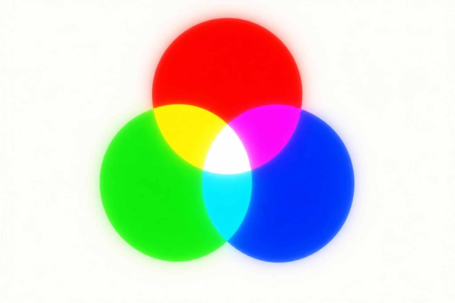
RGB: made of light
Phones, monitors and TVs build colour by firing tiny red, green and blue lights at your eye. Because the screen is backlit, RGB can produce wildly vivid, glowing colours — neons, electric blues, punchy magentas.
White on screen? That's all three lights at full blast.
CMYK: made of ink
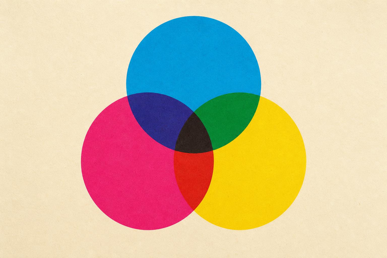
Printers don't have a backlight. They lay down dots of cyan, magenta, yellow and black ink onto paper, and the paper reflects whatever light the ink doesn't absorb. That's a more limited palette, which is why CMYK colours look a touch more muted than RGB — like the world through a nice pair of sunglasses.
White in CMYK? There's no white ink in standard four-colour print. Anything "white" in your artwork is simply the paper showing through. Whatever stock you choose — bright white, off-white, recycled, textured — becomes your white.
So which one should I design in?
If it's going to print: CMYK, from the start.
Design in RGB and the printer has to convert your file at the last minute. That conversion is where unwanted surprises live — a vivid sky blue can flatten, a neon pink can dull, a deep green can shift olive. You spot it only when the box arrives.
Working in CMYK from the beginning means what you see on screen is much closer to what comes off the press.
What if my file is already in RGB?
It's not the end of the world. Most well-behaved photography and brand colours convert cleanly. The risky ones are:
- Neons and fluorescents
- Very saturated blues, greens and oranges
- Anything built from a screen-only colour picker
In Photoshop, convert via Image → Mode → CMYK. In Illustrator and InDesign, set the document colour mode to CMYK before you start. Always check the result visually before sending to print.
Quick checks before you hit send
- Document colour mode set to CMYK
- Linked or placed images converted to CMYK (no stray RGB JPEGs)
- Any brand spot colours (Pantones) named correctly and not converted by accident
- Solid blacks built as rich black where appropriate, single-channel black for body copy
- A proof or preview reviewed on a calibrated screen, not your phone
In short
RGB is for screens. CMYK is for ink on paper. Design in the space your final medium uses, and you avoid 90% of "but it looked different on my laptop" conversations.
Want a second pair of eyes on your print-ready files? Get in touch — we make sure colour, separations and finish behave before the press starts running.