
How to set up working spaces in Photoshop and InDesign
A practical guide to colour working spaces in Photoshop and InDesign — which Colour Settings to choose, why standardised spaces matter, and how to hand off files for accurate print.
Working spaces are one of the most overlooked settings in Photoshop and InDesign — and one of the most important. When a brand colour has to match across a poster, a pack and a press ad, small shifts add up quickly. A few minutes spent on your Colour Settings can save reprints, amends and awkward conversations with clients.
Here is what a working space is, why it matters, and exactly how we recommend setting one up.
Why colour profiles exist
Every screen and every printing press reproduces colour differently. The same numbers — say R0 G0 B255 — will look like a vivid blue on one monitor and a noticeably duller blue on another. The values have not changed; the device has.
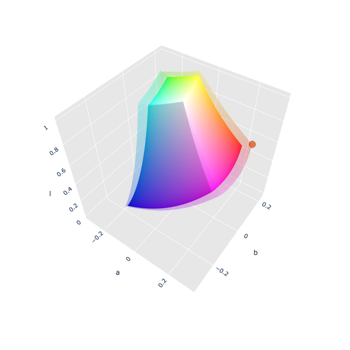
Colour profiles solve this by describing how a set of RGB or CMYK values should be interpreted. They give the numbers a fixed meaning, so the colour you see while editing is the colour your colleagues see, and the colour that ultimately reaches paper.
Work without profiles and everyone in the chain — designer, client, artworker, printer — is effectively looking at a different version of the same file.
What a working space actually is
The profile an application uses while you edit is called the working space (or colour space). Setting it correctly means your RGB and CMYK values are defined by an agreed standard, not by the quirks of whichever monitor you happen to be sitting at.
Setting up your working space
In both Photoshop and InDesign, open Edit › Colour Settings.
1. Choose a prepress preset. Select North America Prepress 2 if you are working to US standards, or Europe Prepress 3 if you are in the UK or Europe. This sets your RGB working space to Adobe RGB (1998) and your CMYK working space to either U.S. Web Coated (SWOP) v2 or Coated FOGRA39 (ISO 12647-2:2004).

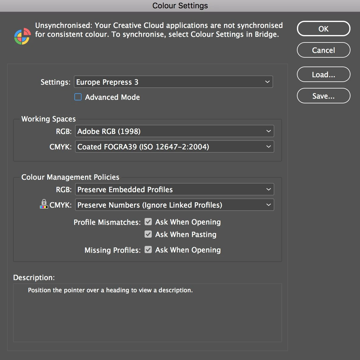
2. Refine the European setup. If you are using Europe Prepress 3, we suggest one small change: set the CMYK working space to ISO Coated v2. It is the official ECI implementation of the Coated FOGRA39 characterisation and is the profile most European printers expect to see.
3. Turn on the mismatch warnings. Tick Ask When Opening and Ask When Pasting for profile mismatches, and Ask When Opening for missing profiles.
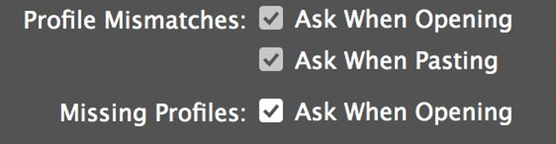
Without these, Photoshop and InDesign will silently discard embedded profiles or convert files into your working space without telling you. You lose control of the conversion — and sometimes lose colour data you cannot get back.
Why standardised working spaces matter
The spaces above are device-independent: they are not tied to a particular monitor, press or paper. That has a big practical advantage.
If you build artwork in a specific printer's profile from the start, you squeeze the file into that press's colour range for its whole life. Reuse the same file for a different printer, stock or format and you are stuck with that reduced gamut. Working in a standardised space keeps the artwork flexible until the moment it actually needs to be committed to a press.
Handing off to print
When artwork is ready to go, it needs converting from your standardised working space to the output profile of the press it is being printed on — the ICC profile for that specific combination of ink, paper and process. That conversion maps your colours onto the closest achievable equivalents in the printer's range.
This is where careful pre-press pays off. A considered conversion — with the right rendering intent, ink limits and checks on brand-critical colours — produces far more predictable results than a blanket export. For more on how output profiles work, see our guide to ICC profiles.
The short version
- Set Edit › Colour Settings to North America Prepress 2 or Europe Prepress 3.
- In Europe, switch the CMYK working space to ISO Coated v2.
- Turn on every profile mismatch and missing profile warning.
- Stay in a standardised working space until it is time to convert for a specific press.
Need artwork prepared and colour-managed for print? Talk to us about artworking.